
Mr. Tech
One of the important goals of geography is to assess the human presence and its impact across the planet. A good starting point is to understand where humans live.
That’s easier said than done. The global population is around 7 billion, with about half living in cities. Many companies have mapped modern cities and smaller settlements with enthusiasm. Companies such as Google and Microsoft, and even the open-source organization OpenStreetMaps, have comprehensive maps of many areas of the world.
But this work tends to focus on the developed world, where potential profits are greatest, and on urban areas where the concentration of people is highest. What’s more, commercial maps vary in resolution and are based on commercial imagery that is hugely expensive to access.
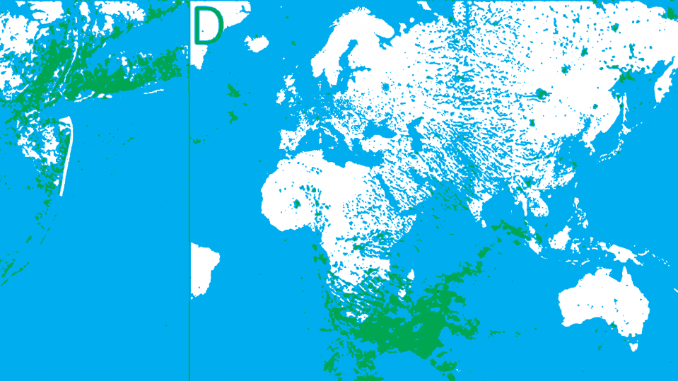
So geographers have long made their own maps of human settlements that are more accurate, globally consistent, and freely available. These maps are based on non-commercial satellite data and cover the entire planet. The first, from the 1980s, had a resolution of around a kilometer; the most recent incarnation, called the Global Urban Footprint, has a resolution of 12 meters and is based on data gathered in 2012.
These maps have their limitations, of course. The Global Urban Footprint is based on radar images taken by a pair of German satellites called TerraSAR-X and TanDEM-X. One problem is that dense forests look very similar to settlements in radar data, and atmospheric conditions can sometimes distort the images.
Settlement maps based purely on optical data have similar shortcomings. For example, the Global Human Settlement Layer produced by the Joint Research Centre of the European Commission is based on 30-meter resolution from the Landsat-8 satellite. In these images, bare soil and sand can sometimes be confused with settlements, and they too can be distorted or obscured by atmospheric conditions.
So geographers dearly want a higher-resolution map that overcomes these problems and that is globally consistent and freely available.
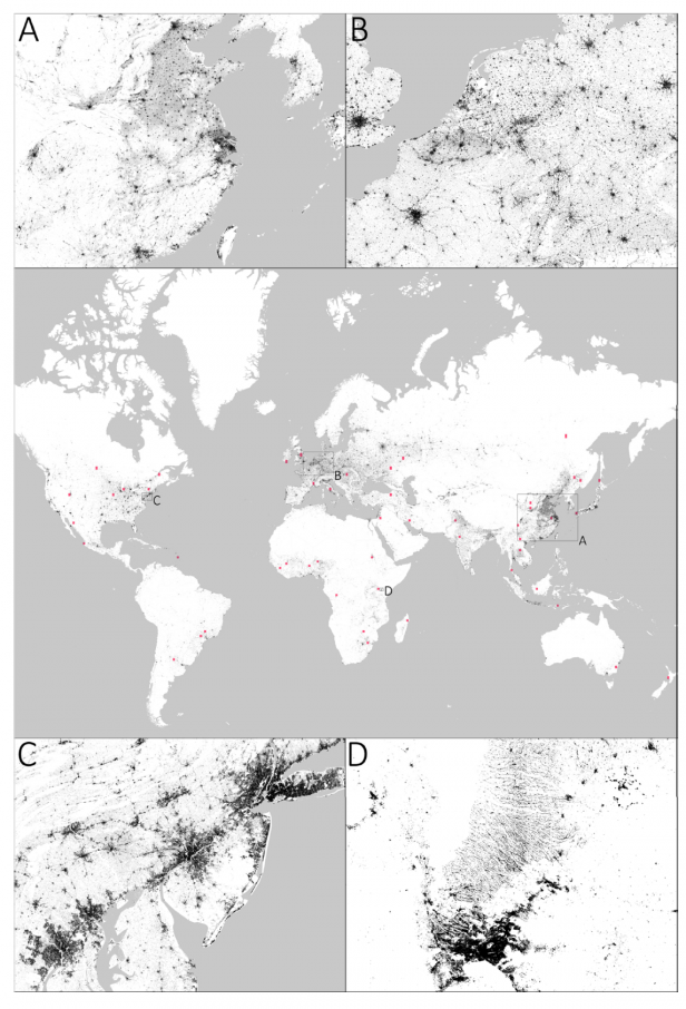
Enter Mattia Marconcini and colleagues at the German Aerospace Center in Wessling, who have unveiled a global map of human settlement that shows humanity’s footprint in more detail and with greater accuracy than ever before. They call their map the World Settlement Footprint 2015 (the year the images were taken), and it is freely available from the academic data-sharing website Figshare. (The data set is huge!)
The researchers have gone to extraordinary lengths to minimize or eliminate the errors that have plagued earlier maps. They do this in two ways.
First, to get around the distortions caused by extreme or unusual weather, they studied several images of the same location taken on different dates but within the target period of the year 2015.
They then compared these images, working on the assumption that human settlements change over time in a different way from other surface features such as forests, agricultural land, and so on. This also mitigates the effects of extreme weather events.
Second, they performed this analysis on radar images from the Sentinel-1 radar satellite and on optical images from the Landsat-8 Earth observation satellite. In this way, the shortcomings of radar images are mitigated by the optical imagery and vice versa.
In total, the team has analyzed over 300,000 images of Earth’s surface, the optical data alone amounting to 1.5 petabytes. “Finally, the two outputs are properly combined together,” say Marconcini and colleagues, adding that this is the first time this kind of double analysis has been performed.
Of course, this work cannot be done by human eyes. Instead, the analyses are performed automatically by a machine-vision algorithm running on a supercomputer in the Czech Republic and by Google via its cloud computing platform. The algorithm is trained to spot human settlements and distinguish them from other land uses.
There is another important difference between the World Settlement Footprint 2015 and previous maps. To ensure that the settlement classification is accurate, the researchers used human crowdsourcing to check a set of 900,000 randomly selected areas against ground-truth data.
Interestingly, that data is Google Earth imagery, which has a resolution that varies from 1.5 meters, for optical satellite images, to just 15 centimeters for airborne data. This commercial imagery cannot be used to make the map itself because it is too expensive.
Marconcini and colleagues describe this kind of validation as “unprecedented.”
The result is a map of humanity’s footprint over the entire planet (excluding Antarctica) with unprecedented accuracy and consistency. There are still some limitations, however. The map has a resolution of 10 meters, which makes it hard to spot small structures such as shacks, sheds, and tents or dwellings sheltered by significant foliage. So it does not account well for nomads or anybody living in a small, isolated dwelling.
Nevertheless, Marconcini and colleagues have created a valuable work that will help demographers, sociologists, economists, and any number of other researchers better understand human settlements and their impact.
“Human settlements are the cause and consequence of most environmental and societal changes on Earth,” they say. This work should help to understand how.
Ref: arxiv.org/abs/1910.12707 : Outlining Where Humans Live ‒ The World Settlement Footprint 2015