
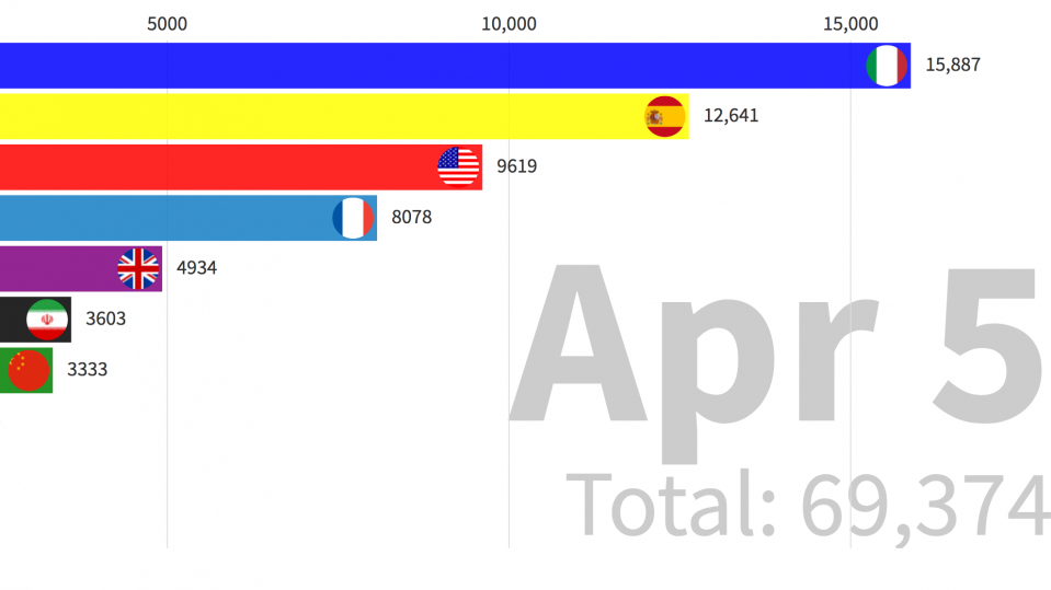
Top seven countries for confirmed coronavirus fatalities on April 5, 2020.
The United States has just reached an unwanted milestone in the coronavirus pandemic: with more than 85,000 positive diagnoses, it now has more confirmed cases of Covid-19 than any other country. Although more people have died from the disease in other countries—Italy has now registered more than 8,000 fatalities, compared with 1,301 in the US—the world's third-largest country is now officially the source of the world’s largest outbreak.
You can read all our coverage of the coronavirus/Covid-19 outbreak for free, and also sign up for our coronavirus newsletter. But please consider subscribing to support our nonprofit journalism.
There are continuing arguments about how accurate these numbers are, not least because different testing regimes across the world mean that the number of undetected cases varies wildly from nation to nation. But the reality is that case numbers in the US could be far higher than reported, too: on March 6 Vice President Mike Pence announced that 3 million tests would be available “by next week“; the Atlantic’s Covid tracking project so far estimates that only 540,000 tests have actually been administered.
So what does this actually look like?
Most of the graphs produced to track the disease so far have shown the growth in cases and fatalities on either a linear scale (which plots data along a fixed axis and is useful for seeing the raw increase in incidents) or a logarithmic one (which plots its data on an exponential scale, and is used by epidemiologists to monitor the rate at which outbreaks are growing).
Here is a visualization, based on the same data used by Johns Hopkins to produce its dashboard, that shows growth in the number of cases over time in animated form. Just hit the Play button at the bottom left to see the situation evolve over time. Note: the data are accurate until April 5.
What becomes clear here is that China’s tens of thousands of cases rocketed in the early weeks of the disease, but tailed off before almost any other significant outbreaks had happened. Explosive growth in case numbers in the US, Italy, and Spain took place only once China’s outbreak had stabilized.
And here is the same approach looking at an even more stark set of figures: the number of fatalities.
China’s large number of deaths again slows down before outbreaks elsewhere start claiming lives. Italy’s total was less than 100 on March 3; by March 28, it had passed 10,000.
Sources: JHU CCSE.
