Business Impact
Between Friends
Sites like Facebook are proving the value of the “social graph.”
Blogosphere
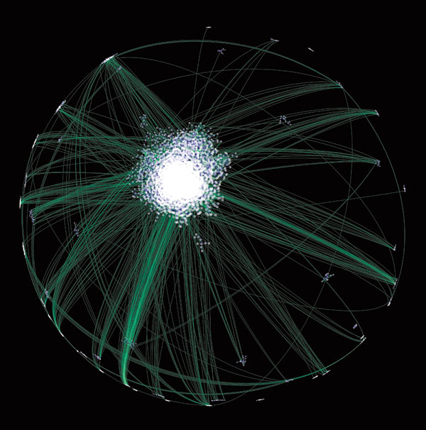
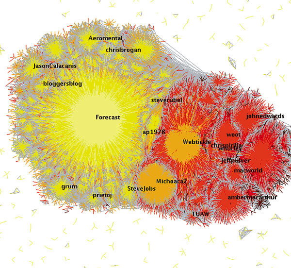
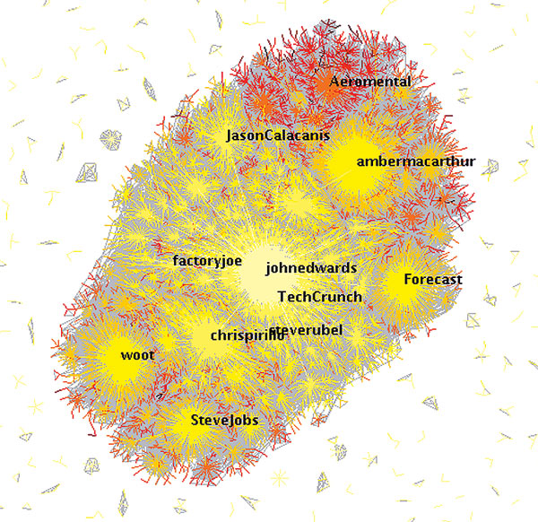
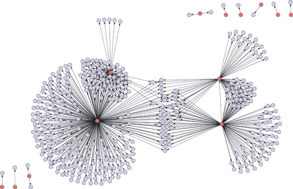
Communities that form around the exchange of information stand out in Matthew Hurst’s visualizations of the blogosphere. Hurst, a scientist at Microsoft’s Live Labs, used a search tool he helped design, called Blogpulse, to generate the data on which his images are based. The dense cluster at the center of this image represents what Hurst calls the core, a set of a few thousand blogs with links to and from many other sites. Other, smaller blogging communities connect to the core through one-way links (usually produced when an obscure blog at the edge links to a well-known blog at the core), represented here by hairlike strands.
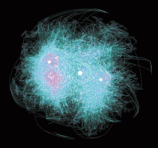
The core of the blogosphere, made up of several thousand popular blogs that are heavily connected to one another, divides into two regions when seen up close. The region on the left, at the center of which are two areas showing a lot of pink, contains political blogs; the region on the right, divided from the first by the triangular indentation at the bottom, contains blogs focused on gadgets and technology. The two regions are held together by popular blogs with ties to both subject areas. The size of the circle representing a given blog is proportional to the number of other blogs linked to it. Hurst notes an apparent difference in culture between the two regions: pink lines, which represent reciprocal links, are much denser among the political blogs than they are among blogs focused on technology.
Maps of online social networks often reveal little more than the fact that two users have linked to each other’s profiles. That type of map becomes meaningless when, as is typical on MySpace, many users have more than 100 such links and sometimes as many as a million, says Dietmar Offenhuber, a research assistant at the MIT Media Lab. The Comment Flow visualization he created with associate professor Judith Donath traces actual communication between users. Offenhuber and Donath created these images by tracking where and how often users left comments for other users; connections are based on these patterns, rather than on whether people have named each other as “friends.”
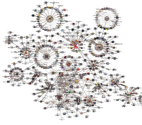
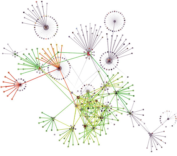
People have different intentions when they share information through social networks, says Akshay Java, a member of the eBiquity Research Group at the University of Maryland, Baltimore County. He cites three purposes that bring users to the microblogging site Twitter, where they share brief updates via text message, instant messenger, and the Twitter website: finding information, sharing information, and having conversations. These images show the different networks produced by the different types of communication. When all connections as of April 2007 are mapped, news sources appear as huge nodes. (The different colors reflect a loose attempt to group close contacts together.)
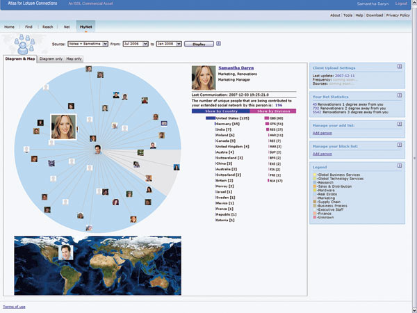
IBM’s Atlas maps social networks in the workplace; the program’s MyNet component can identify users’ connections on the basis of their relative positions within the company and their communications by e-mail and instant messenger. The resulting map not only shows contacts (along with their locations and organizations) but also measures how close they are. One view shows particularly close contacts near the center of the diagram and distant ones toward the perimeter. Chris Lamb, senior product manager for IBM’s Lotus Connections software, says workers can use the tool to maintain their professional networks. For example, a person might notice an important contact drifting toward the perimeter of the circle and take steps to catch up before the connection fades.
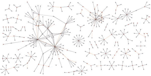
Several years ago, a large retailer tried to encourage word-of-mouth marketing for products sold on its site by offering incentives to site visitors who made product recommendations. Many companies are trying to use people’s social connections for such “viral marketing” programs, hoping that information about products (and the urge to buy them) can spread through a network of people the way a virus might. But after studying more than 15 million recommendations generated by the retailer’s incentive program, a team made up of Jure Leskovec, Lada Adamic, and Bernardo Huberman, director of the information dynamics lab at Hewlett-Packard, was skeptical. Huberman and his colleagues looked at the networks that grew up around each product–who bought and recommended it, and who responded to the recommendation–and saw that they took on different characteristics depending on the type of product. A network around a medical book, where red dots and lines indicate people who purchased the book while blue dots and lines represent people who received a recommendation, shows a scattered network where recommendations, on average, don’t travel very far.
Advertisement